Designing the VRT MAX streaming experience
For a year I worked across the playback experience of VRT MAX, Flanders' public streaming platform. I redesigned the player around chapters and highlights, helped shape the sharing experience, and set up a research framework for user-testing accessibility features.
The context
VRT MAX is where Flanders watches public broadcasting on demand — series, news, and live sport. The video player is the heart of the product: it's where people actually spend their time, and it has to work for a huge range of content, from a 20-minute news bulletin to a two-and-a-half-hour football match. Small frictions in the player are felt by everyone, every day.
Highlights and chapters in the player
I redesigned the player so a long video is no longer one undifferentiated timeline. Key moments are marked directly on the scrubber as chapters and highlights, with a clear "next highlight" control so you can jump straight to what matters instead of hunting through hours of footage.
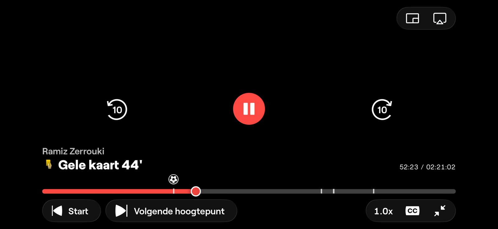
This first rolled out during the World Cup. Most matches aired late at night, so plenty of people woke up to a finished game they hadn't seen. With highlights on the timeline, they could scrub straight to the goals and key moments — a yellow card at 44', the build-up to a goal — and catch up in minutes rather than re-watching the whole match.
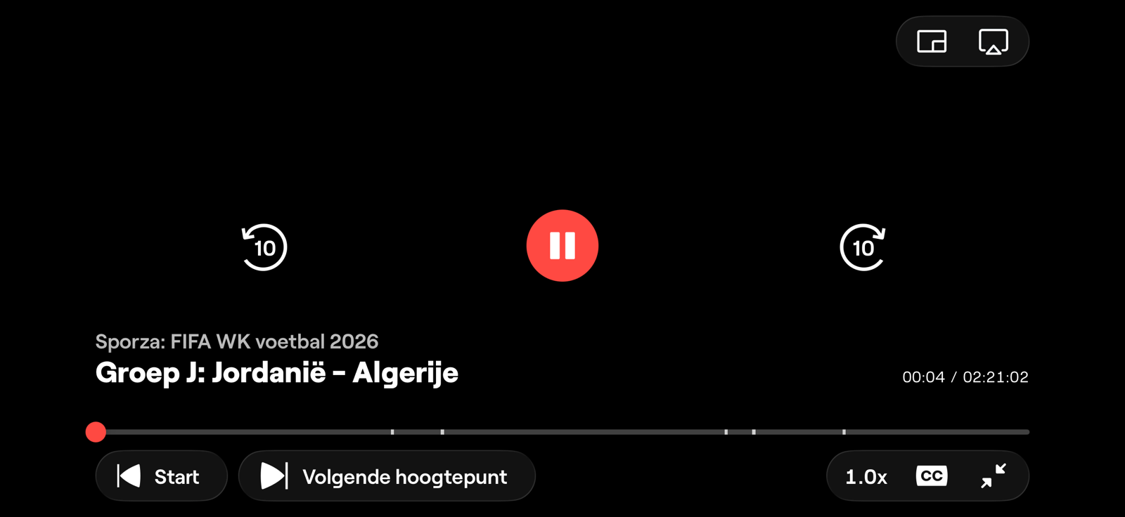
The design goal was simple: turn a passive timeline into something you can navigate by meaning. For a late-night match, "show me the moments that mattered" beats "scrub blindly through two hours."
Designing the scrub experience
The interesting work was in the details of scrubbing. As you drag through the timeline, the information for the highlight you're on replaces the title of the show you're watching, rather than appearing as a separate label. It was a deliberate trade-off: it preserves screen space and avoids adding clutter that would only ever show up while passing a highlight.
We were also careful not to spoil the game. Before you reach a highlight, it's nothing more than a small white indicator on the bar — no label, no icon, no hint of what happened. Only once the scrubber moves past a highlight do we reveal an icon for the event, so you decide when to learn what's coming.
And because a timeline is something you feel as much as see, passing a highlight triggers a subtle haptic vibration — a small physical cue that you've just crossed a key moment, even before you look down at the screen.
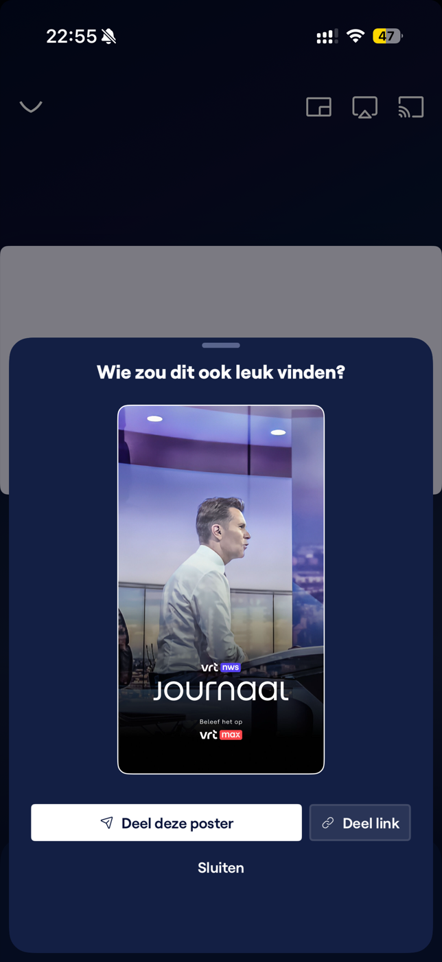
The sharing experience
I helped shape the sharing experience — the flow that lets someone send a programme to a friend. Rather than sharing a bare link, the player generates a poster for the title, framing the share as "who would also like this?" so the thing that lands in a chat actually looks like the content it points to.
A research framework for accessibility
Beyond individual features, I helped set up a research framework for user-testing accessibility features — a repeatable way to put accessibility decisions in front of the people they're meant to serve, instead of guessing. The aim was to make accessibility testing a routine part of how the team works, not a one-off audit.
My role
My role was primarily UX Designer: designing meaningful experiences with the user always in mind. The work went broad — clustering different types of related content, discussing search behaviour with developers, and defining a research framework for accessibility features. I moved between research, technical logic, and data structures, figuring those out where I needed to, because a meaningful user experience usually depends on getting the layer underneath it right.
Experimenting with AI
At VRT I had the liberty to experiment with AI tools like Claude Code. We discussed our findings openly as a team — what worked, what didn't, and how it could and would reshape our workflow — and I helped other designers get to grips with what looks like a "technical" tool so they could leverage it in their own design process. I used it myself to build a working prototype of the player redesign, turning the interaction ideas in this case study into something you could actually click through.