1,115 people told us what's wrong with their watch list
"Mijn Lijst" is one of the most visited pages on VRT MAX — but it was stuck in a simple chronological view with no way to sort, filter, or organize. I ran a deep-dive user survey to understand how people actually use their list, why some don't, and what would make it better. 1,115 responses later, the findings reshaped the feature's roadmap.
The context
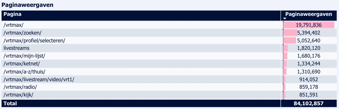
VRT MAX is Flanders' public streaming platform. "Mijn Lijst" lets users save shows, films, and podcasts for later — a simple concept that turns out to be anything but. Analytics showed it was the 5th most-visited page on the platform. Excluding landing pages like home and profile, it ranked 3rd. People relied on it heavily, but the feature itself hadn't evolved: a flat, chronological list with no sorting, filtering, or structure.
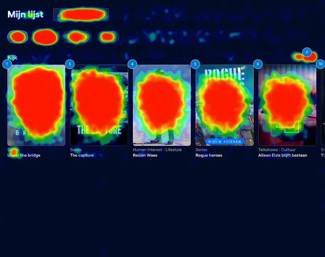
Heatmap data told the same story. 11.35% of all clicks went to the first item — the most recently added one. The scroll button ranked second at 9.89%, which told us users were actively searching for items that weren't immediately visible. People had outgrown the current design.
The approach
I designed and deployed an in-app survey directly on the "Mijn Lijst" page, running from 24 to 27 October 2025. The pop-up reached 24,733 users across web, Android, and iOS, with a 4% click-through rate and a median completion time of 69 seconds.
The survey combined closed questions — frequency of use, list size, reasons for non-use — with an open-ended question: "What would make Mijn Lijst more useful for you?" That last question generated 728 written responses, which I manually coded into thematic clusters.
One important nuance: the survey ran on the "Mijn Lijst" page itself, which means active users were overrepresented. I flagged this bias throughout the report so stakeholders could weigh the findings accordingly.
What people use it for
Two use cases dominated: saving content for later and quickly resuming what they were watching. Tracking new episodes was a secondary but meaningful need. The "other" responses clustered around quick access, favorites, and finding things back easily — all variations on the same theme: "Mijn Lijst" had become a personal homepage for many users.
56.6% said they use it on every visit. Another 23.1% said daily. Combined, nearly 8 in 10 users interact with their list at least once a day.
Why people don't use it
Among non-users, the reasons were surprisingly basic: 53.4% said they didn't know what the feature does. Another 27.6% simply forgot it existed. Only 5.2% thought it wasn't useful. The barrier wasn't value — it was awareness.
This was especially pronounced in the 65+ cohort, where 77.8% said they didn't know what it does. For the 55–64 group, responses split more evenly between not knowing, forgetting, and other reasons. The data made a clear case for better onboarding and discoverability — not more features.
What users actually asked for
The open-ended responses painted a consistent picture. Users wanted more control over how their list looked and worked. The top requests, coded from 728 responses:
- Sorting and custom ordering (23.9%) — by availability, date added, alphabetical, most watched, genre
- List/grid view (13.2%) — horizontal scrolling felt limiting; users wanted to see everything at once
- Custom groups or folders (7%) — people wanted to organize by category, content type, or personal labels
- Availability and expiry dates (5.1%) — "show me when something is about to leave VRT MAX"
- Better resume functionality (4.5%) — pick up where you left off, even across seasons
- More metadata per item (4.4%) — series vs. film, new episodes, average duration
- Notifications (4%) — alerts for new episodes or content about to expire
- Auto-cleanup of unavailable content (4.1%) — remove or flag items that are no longer on the platform
The insight
The core finding wasn't about any single feature request. It was that "Mijn Lijst" had silently become one of the most important pages on the platform — a personal content hub — while the design still treated it as a simple bookmark shelf. The gap between how people used it and how it was built had widened to a point where it was creating real friction.
The quantitative data showed the scale: daily use by nearly 80% of respondents, 11 items on average in their list, and heatmaps revealing users scrolling past the fold to find what they needed. The qualitative data showed the direction: sorting, structure, and visibility.
My role
I initiated and owned the entire research process: defined the research questions, designed the survey, coordinated the in-app deployment, analyzed both quantitative and qualitative data, and wrote the final report. The qualitative coding — turning 728 open-ended responses into actionable themes — was done manually to preserve nuance and catch patterns that automated tools would miss.
The report was presented to product and engineering stakeholders and directly informed the roadmap for "Mijn Lijst" improvements.
What I learned
Sometimes the most impactful research isn't about uncovering surprises — it's about putting numbers behind what the team already suspected. Everyone had a hunch that "Mijn Lijst" needed work. But "79.7% use it daily" and "53.4% of non-users don't know what it does" are statements that move roadmaps. Hunches don't.
I also learned to be upfront about bias. The survey ran on the page itself, so power users were overrepresented. Flagging that early and often made stakeholders trust the data more, not less. Transparency in research methodology earns you credibility when the findings matter.